Blog

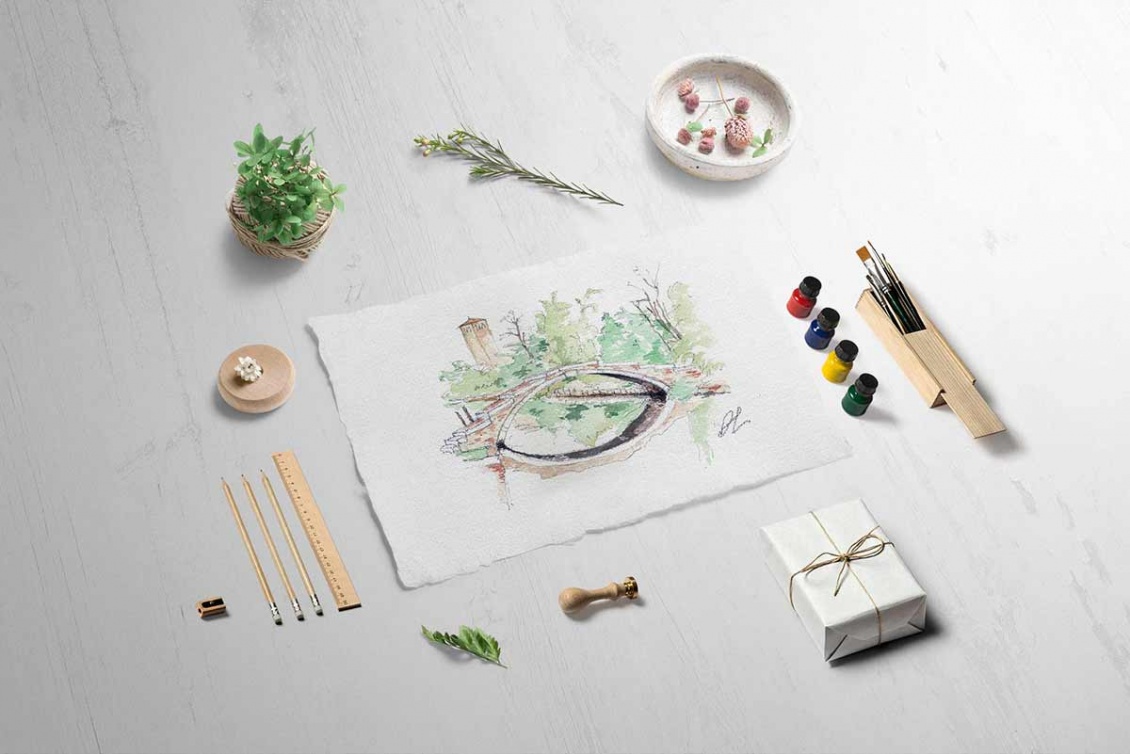
Ponte del Diavolo (Devil’s Bridge) in Torcello

Torcello is one of the oldest islands of the Venetian lagoon, north of Burano, in the middle of a salt marsh zone (clay soil lying areas which are periodically flooded by tides and which are fundamental for the health of the lagoon).

Torcello was very prosperous and densely populated since the first centuries of the Roman Empire, and it began its decline from the fifteenth century because of climate changes and continuous plagues, and also because of the predominance of Venice.

One of the two bridges of Torcello is the Ponte del Diavolo (Devil’s Bridge), that crosses the Maggiore Canal, the waterway that connects the historic center of Torcello with the lagoon. It goes back to the fifteenth century but recent archaeological investigations have established that its foundations are grafted onto pre-existing foundations, dated thirteenth century.

The origin of the name is uncertain. Some say that “Diavoli” (Devils) was the nickname of a local family who gave the bridge its name; other say the name comes from a legend about a Venetian girl, a witch and an Austrian soldier.

The legend says that the girl falls in love with a young officer during the Austrian invasion, but the union was disliked by her family, who send her away. One day the girl hears the news that the young lover has been murdered.

The girl returns to Venice and meets a witch, with whom she enters into a pact with the devil: the young Austrian in exchange for the souls of seven died prematurely Christians children.

The site of the exchange would be the Devil’s Bridge.


The two women reach the island and the girl crosses the bridge with a candle and a golden coin while the witch invokes the devil. The devil, as soon as he sees the girl, spits the key of space and time into the water taking the gold coin, making the young Austrian appear at the other side of the bridge.

The second half of the pact had to be the delivery of the seven souls on the Devil’s Bridge, scheduled for December 24th, but the witch was murdered before the exchange by a young man who wanted to save the souls of children.

Legend has it that from that December 24th onwards, every year the devil appears on the Devil’s Bridge to get his payment, in the form of a black cat.

The main feature of the Devil’s Bridge is its shape without railings, typical of the Venetian ancient bridges, and together with the Ponte Chiodo (Nail’s Bridge) in Cannaregio, it is the only one to preserve the ancient form.

Palazzo Dario, the cursed palace

A horrible fate has combined the stories of the owners of this beautiful building, so as to define it “cursed”.

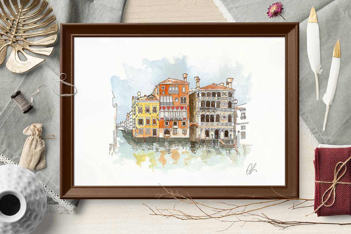
Palazzo Dario (known as Ca’ Dario) is a palace overlooking the Grand Canal in Venice.

It was built by Giovanni Dario, fascinated by the places and the enchanting landscape.

In 1479 Marietta, Giovanni’s daughter, committed suicide because of the economic failure of her husband Vincenzo Barbaro, who died stabbed. Even their son suffered a violent death, in fact he died in an ambush in Crete. These three deaths caused a sensation among the Venetians, who anagrammtized the inscription on the facade, turning “VRBIS GENIO IOANNES DARIVS” into “SVB RVINA INSIDIOSA GENERO“ (in Latin, “I generate under an insidious ruin”).

The descendants of the Barbaro family sold the villa to Arbit Abdoll, an Armenian merchant of precious stones, who ended up in ruins shortly after taking possession of the dwelling.

The Englishman Radon Brown met his fate in 1838 when he became the new owner of Ca’ Dario. In only four years he suffered a financial meltdown and his homosexual relationship was discovered: the scandal engulfed him so much that in 1842 he committed suicide in the palace together with his partner.

Fared no better the American Charles Briggs, who had to flee from Venice because of the continuous rumors about his homosexuality: he fled to Mexico, where his lover committed suicide.

In the early ‘900 Ca’ Dario hosted the French poet Henri de Regnier; but a serious illness struck the writer, so he couldn’t come back to Venice anymore.

For decades the building was empty, until 1964 when the tenor Mario del Monaco began the negotiations to buy the property. But the artist, on his way to Venice to finalize the details of the contract, was involved in a serious car accident that forced him to a long rehabilitation and made him decide to give up the purchase.

A few years later Ca’ Dario was bought by Count Filippo Giordano delle Lanze from Turin, who was killed inside the building in 1970 by a Croatian sailor named Raul Blasich, with whom he had a relationship. Blasich then fled to London, where he was murdered.

The palace was later bought by Kit Lambert, manager of the rock band The Who, who died a very short time later in London falling down stairs. Although he claims not to believe in the curse, Lambert had told some friends to sleep in the nearby Hotel Gritti gondoliers kiosk to “escape the ghosts that haunted him in the Palace”.

Fabrizio Ferrari, a venetian businessman, bought the house in the 80s and moved there with his sister Nicoletta. Ferrari did not die, but he lost all of his assets after taking possession of the building, while his sister died in a car accident without witnesses.

In the late 80s, the building was purchased by financier Raul Gardini who wanted to make a gift to his daughter. Gardini, after a series of economic setbacks and the involvement in the scandal of Tangentopoli, committed suicide in 1993 in never fully clarified circumstances.

After the death of Gardini, no one wanted to buy Ca’ Dario anymore, and the first brokerage company that had been mandated to sell surrendered and stranded down. At the end of the 90s the director and actor Woody Allen seemed willing to buy the building, but then he desisted. In 2002, a week after renting Ca’ Dario for a vacation in Venice, bass player John Entwistle died because of a heart attack.

In 2006 the property passed to an American company on behalf of an unknown buyer and it is currently being restored.

And here below you can see Palazzo Dario (the last one on the right). Do you want to get a closer look? Click on the pic!

Did you like this story?

Do you want to read other stories like that?

If you subscribe the Newsletter, you’ll receive the latest blogposts in your email.
If you love Venice, if you love Art, if you want to learn more stories from this wonderful city, you have only to click the button below!

Handmade frames for handmade prints

Some time ago I met here at my studio in Venice Marco Faccio, a nice and friendly guy from Vicenza who came here with his wife Clara. They loved some of my works and we talked a lot, and so I knew that Marco is a very talented wood craftsman. After they left the studio, I went to visit his website and I realized that I did love his artworks so much!

He makes (all handmade, of course!) frames, boxes, (unbelievable) towerboxes, cases.. everything is wonderful!

And I’m very happy that he decided to do something for me.

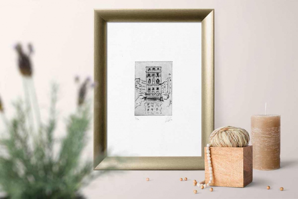
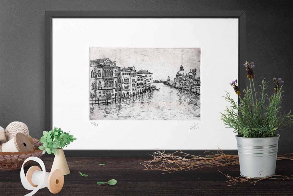
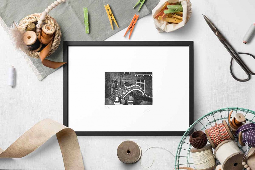
Marco took inspiration from my etchings and made a study of shapes and materials and then he made these handmade African durmast frames for my prints. The frames, made of solid wood, have been waxed and have a durable synthetic glass and they are unique works of art.

The frames and the prints are viewable at my store in VeniceMarco chose the following prints to build his beautiful frames:

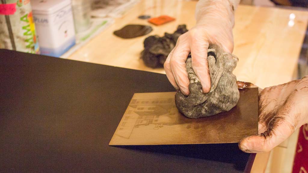
I have printed the etchings in brand new colors- a color between red and brown.

I hope you’ll like the new frames as much as I do!

Ciao,

Arianna

The history of printmaking – part 2

In Venice, in the fifteenth century, the Republic of Venice is at its peak as territorial expansion, and it is a model and benchmark for the world because of its opening to the religious philosophies, and it is a city ready to welcome all thoughts and trends guaranteeing press freedom.

This is why in that time a large group of “Humanist reformists” comes to Venice, including Aldus Manutius (in 1490), Marco Antonio Sabellico (teacher of rhetoric and author of several works including prayers, writings about  topography and Venetian courts) and Francesco Colonna (Dominican friar of the Venetian monastery of Saints John and Paul).

The “Scuola dei stampatori e dei librai” (School of printers and booksellers) met in the Dominican monastery of Saints John and Paul (the present hospital).


On September 18th, 1469, the Senate recognizes that Johann of Speyer (German printer) have introduced and developed the art of printing in Venice, while the “statuto dei Librai e Stampatori” (the statute of the Booksellers and Printers) will be ratified only in 1567.

In 1472 Filippo di Pietro is the first printer properly Venetian (active until 1482).

In 1488 there are almost 200 printing houses in Venice.

One of these is the printing house of Aldus Manutius, not just a typographer but a real publisher (the first in a modern way), who prints 157 titles (even more than a thousand copies with the use of a hand press) between 1495 and 1501.

The environment of his printing house becomes a real literary circle which includes the most outstanding humanists of Italy.

The first studio of the printer is in Calle del Pistor, number 2343, near Campo Sant’Agostin; then he moved onto San Peterniano, near what is now Campo Manin, in 1508.

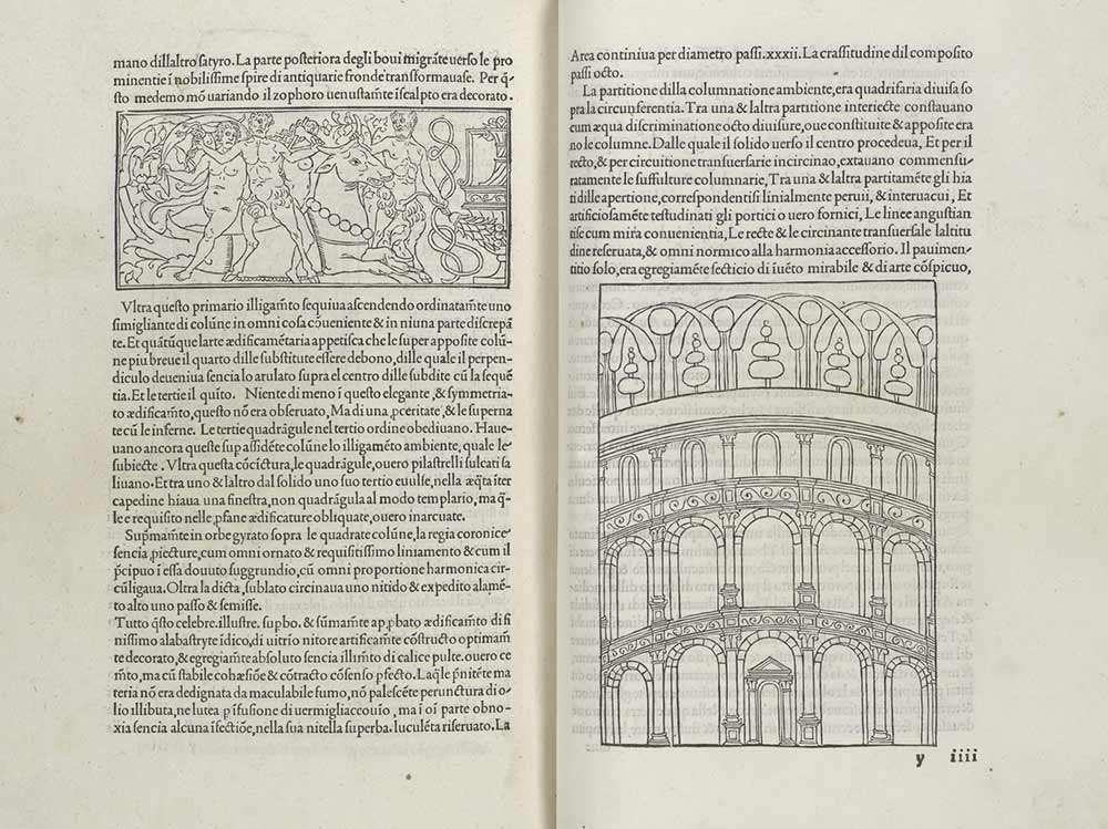
In 1499 Aldus Manutius publishes the ‘Hypnerotomachia Poliphili’, a novel in prose accompanied by 172 xylographs and attributable to the Dominican Francesco Colonna, who is one of the finest books of Italian Humanism.

In 1502 he founded an academy, the “Neacademia dei filelleni” or Aldina, where it was required to speak in ancient greek; those who did not speak ancient greek had to pay a pecuniary fine.

He wants to preserve the literature and the Greek philosophy to further oblivion, along with the great heritage of Latin literature, disseminating the masterpieces in printed editions.

On November 14th, 1502, Aldus Manutius gets from the Senate the prestigious post of Official Printer of the Republic, thanks to his experience, talent and ability. It is unanimously accepted that his trademark (an anchor and a dolphin) refers to the motto “Festina lente” (more haste, less speed) attributed by Suetonius to Octavian Augustus.

Among the most significant contributions of Aldus Manutius to modern typography there is the final version of punctuation, the invention of italics and the beginning of the paperback editions. He was also the first to publish a catalog of his works and he has edited the first book with the pages numbered on both sides.

At the end of the fifteenth century, many engravers in Germany, Holland and Italy reach highest quality results.

The aquaforte etching (engraving on metal plate through the use of acids) was born as an autonomous technique in the early sixteenth century, although the chance to engrave the metal with acids was known since the end of ‘400.

The famous German artist Albrecht Dürer (who begins as a wood designer for woodcuts) was one of the first to use the new aquaforte etching technique- a technique that has probably learned from the Venetian Luca Pacioli (religious, mathematician and italian economist who attended the famous artists of the time ), during his trip to Italy.

Parmigianino (1508-1540) was the first artist to understand the possibilities of the aquaforte etching, using it as a fast means of expression, full of warmth and vitality.

The spread of the aquaforte etching technique frees the artist from the mediation of the artisan, who used to copy his design on wood or on metal plate, mixing together the figure of the artist and the engraver.

Year after year the techniques already existing are improved and new ones are invented, which provide the artists more and more expressive possibilities, as the technique of aquatint (which allows to create veiled painting on the plate, unlike the etching which allows to create lines), perfected by the French artist Jean-Baptiste Le Prince in 1768.

Among the artists who have used this technique we must remember  Francisco Goya, who shows the enormous pictorial possibilities of the technical means.

In the Italy of ‘700 should be mentioned artists such as Tiepolo, Canaletto and Piranesi for their high quality works standing apart from the myriad of artisans reproducing works by great masters or detailed views.

In the eighteenth century engraving it became almost exclusively a means to reproduce artworks and portraits and it is brought to a form of industrialization, with the birth of companies that use numerous engravers.

The increasingly refined techniques turn the incision to a mechanistic way, without the beginning vitality and autonomy.

In the late nineteenth century, with the birth and the emergence of photography, the etching with utilitarian and reproductive purposes almost disappears.

From the twentieth century, thanks to artists who come to this ancient discipline with creative spirit, the etching has regained the dignity and freedom of speech that was a characteristic of the beginning of its history.

The history of printmaking – part 1

The Art of printing was born in China during the Han Dynasty (a print on fabric can be dated 220 AD), although some artifacts have been discovered in Egypt dating from the sixth or seventh century BC.

The first type of printing was made pressing a small wooden carved board carved on fabric or paper, the Xilography (from the greek xilon = wood and graphos = handwriting), where it is eliminated the space that will remain white on the print and the printable portion of the matrix is what remains of the original thickness of the plate.

The oldest printed book is a Chinese translation of the “Diamond Sutra“, a Buddhist work, realized in 848 AD

In a memorial dating back to 1023 it is said that the Chinese government was using copper plates (intaglio) to print banknotes and official documents.

The technique of Xilography, together with Papermaking, is taught by the Chinese to the Arabs when they conquered Samarkand in 712, and spreads across European countries conquered by the Arabs.

In Europe, from the sixteenth century, the Xylography is commonly used to print fabrics, and from 1400 (when the paper becomes easily available) is used to print playing cards, to print religious images and texts of prayers, and for artistic productions.

Some xylographs could be used for a small number of images which were then bound together to form the first books, which were printed in European convents between 1380 and 1430, and included images and texts.

Printing entire books in this way was a long process because each page was made carving a wooden tablet, which often broke for its fragility.

The most ancient book that speaks about woodcuts with a printing purpose “Trattato della Pittura o del Libro dell’Arte” (The book of the Art) by Italian Cennino Cennini in 1437.

In 1041 in China Bi Sheng invented movable type printing using the clay, but it was too fragile. In 1298, still in China, Wang Zhen introduces a more durable type made of wood, while in Korea, in 1234 the mobile characters are created using metal bronze.

In Europe, Johannes Gutenberg invents the text printing using movable metal type made of iron and steel, the strongest materials known at the time. We can not be sure that Gutenberg did not come in contact with this technique thanks to the trade routes with the East, but surely he has perfected it through the invention of the printing press modeled on the winepress of the Rhenish farmers, and through the improvement of the printing ink, oil-based instead of water-based, and therefore longer lasting.

With the spread of movable type, the technique of xylography to print full pages falls into disuse, but a way to combine images xylographic with texts composed with movable type is soon found, loosing yet the previously continuity and interpenetration of the text with the pictures.

The search for the particular in illustrations pushes artists to experiment the metal engraving, Chalcography (from the greek chalcos = copper and graphos = handwriting), where the drawing is traced through the use of the burin digging the plate which is then inked and printed (unlike the xylography, worked in negative, where the print result is given by the digging of the wooden plate of what will result white, in chalcography -worked in positive- the result of printing is given by the signs made on the plate that will be the actual final drawing).

The origins of the chalcography are uncertain: it is expected to be born in Germany around 1430 with the use of the roller press which replaces the vertical one used for the xylography.

The engraver who has made the first known chalcographic prints works in Basel from 1430 to 1445.

Giorgio Vasari attributes to Maso from Finiguerra (1426-1464) the discovery of Chalcography, using the “niello” technique used by jewelers, who used to engrave a metal plate with the burin and then filled the cavity with a special alloy, called “nigellum” obtaining dark images on a metal smooth background. The goldsmith, before filling the grooves with the alloy, used to make a test of the work done by filling the signs of the burin with a mixture made up of lampblack and walnut oil (more or less the copperplate ink still used) and printing the plate on a piece of wet paper.

The Art of printing spreads quickly across Europe.

End of part 1

The Art of printing in Venice

In the 15th Century the Venetian Republic reached the height of its expansion.

No European state could or would ever again boast such a great future and such a long period of continuity.

The “Serenissima” was particularly open to all religious philosophies, provided that none of these threatened its safety.

The first printers to arrive in Venice were German, followed by French, Flemish, Dutch, Swiss, Cretian and Istrian printers and many Italians.

A large group of  “reformist Humanists” fled to Venice, and among them Aldo Manuzio (https://en.wikipedia.org/wiki/Aldus_Manutius).

The freedom of the press was guaranteed and encouraged, especially since the expansion of printing had become such a good source of income in a matter of a few years. Venetian publishing not only called for collaboration, but also stimulated printers to experiment. The Senate even set down severe penalties for publishers who dared to use low-quality paper in 1537.

It is logical, therefore, to assume that authors not only saw Venice as the chance to get their works published, but also as having the facilities needed to accomodate them, plus the opportunity to discuss and compare their individual experiences.

Nearly 200 printing presses were operating in Venice towards the end of the 15th Century (1488).

The Art of printing was officially recognized in Venice on September 18th, 1469- the day the Senate recognized that Johann von Speyer had introduced and developed the art in Venice.

The “Scuola dei Stampatori e Libreri” always met at the Dominican monastery of Santi Giovanni e Paolo (the current hospital).

The cultural climate enjoyed by printers in Venice was that of a city ready to welcome all schools of thought and trends, filtering these and turning them into its own peculiar heritage. A real university was never established in Venice. Numerous cultural centres existed, however, such as the circle of the Greek scholar Giovanni Lascaris and the Rialto and San Marco schools holding classes in moral philosophy and rhetoric (only open to the noblility).

There were important centres for intellectual discussion with splendid libraries attached to them in the monasteries of the churches of Santi Giovanni e Paolo, Santo Stefano, S. Francesco della Vigna, San Michele in Isola and Sant’Antonio in Castello.


ALDO MANUZIO AND HIS TRADEMARK

Aldo Manuzio was not just a printer, but an actual publisher. An extraordinarily erudite man, he helped preserve many texts and guaranteed excellent results.

The printer’s early headquarters were in Calle del Pistor, number 2343, near Campo Sant’Agostin; he moved his operations to Calle San Paterniano near what is now Campo Manin in 1508.

As a printer, he published the Hypnerotomachia Poliphili in 1499 for the publisher Leonardo Crassus in Verona.

He was also famed for having invented his own type, possibly with the help of the philosopher Friar Luca Pacioli and the designer Francesco Griffo of Bologna.

Manuzio’s books were held in great regard and received numerous awards throughout Europe, but suffered precisely for this reason from imitation and counterfeiting by other publishers, especially in Florence and Lyon.

His printing house became a true literary circle. Manuzio was aware of his great responsibility: he summoned the most outstanding humanists of the time in Italy to act as correctors (not just translators and editors of drafts, but proper editors and editorial consultants).

Also his choice of paper -produced by the Fabriano papermill (the best on the market), format 32 x 42 cm- led to surprising result. When folded in half, he got the “folio” (32 x 21 cm), in four the “quarto” (16 x 21 cm), in three the “octavo” (10.5 x 16 cm). Manuzio designed and started using the “octave” with great commercial success: in other words, he had already invented the paperback (pocket book or “encheridio”) in the early 16th Century.

In May 1502 Manuzio founded an academy, the “Neacademia dei filelleni”, or Aldina Academy. He encouraged business relationships, collaboration and friendship with the best minds of the time, and he was a very prolific publisher.

Thanks to his expertise, talent and skill, the Senate appointed Manuzio as the official printer of the Venetian Republic on November 14th, 1502, having been sponsored by Marin Sanudo il Giovane (1466-1536).

It is unanimously accepted that his trademark (an anchor and a dolphin) refers to the motto “Festina lente” (more haste, less speed) attributed by Suetonius to Octavian Augustus.

Thanks to Franco Filippi

Source: The Art of printing in Venice by Franco Filippi (http://www.venicethefuture.com/schede/uk/323?aliusid=323)

Ukiyo-e

The works of Utagawa Hiroshige, one of the leading exponents of Japanese art, are displayed in exhibition at Palazzo Grimani – Venice, from September 20th until January 11th.
I went to visit the exhibition (I’ll talk about the exhibition soon in this blog) and I would like to share with you the story of ukyo-e and its origins.

I hope it can be interesting and I also hope to offer you some ideas or simply give you informations that you did not know.

This article is divided into three parts, this is the first one.

The Ukiyo-e is a kind of Japanese xylographic Art Print. Since it is made through the impression of multiple wood matrices in a single subject (each matrix prints at least one color), it shows a wide variety of tones and shades of colors.

The term Ukiyo-e literally means “image of the floating world“, a world that is constantly changing.

The word is also an allusion to the homophone term “world of suffering”, the continuous cycle of death and rebirth, which Buddhists try to avoid achieving enlightenment.

The words of the Japanese writer Asay Ryoi well explain the meaning of this term:

“Contemplating the natural spectacles of the moon, the snow, the cherry blossoms and maple leaves, the taste of singing songs, drinking sake and taking pleasure only in floating along the current of the river as a dried pumpkin shell.”

The rudiments of printing come from China in the Middle Ages and have their first spreading among Buddhist monks.


The genre takes its connotation in the Edo period (1600) thanks to the spread of the merchants, the creation of picture books and posters of the Kabuki theater.

It was originally used only Chinese ink in monochrome prints, later some prints were hand-painted, till when Suzuki Harunobu, in the eighteenth century, developed the technique of polychrome printing to produce nishiki-e.


Huck Scarry – Diario Veneziano

Huck Scarry (whose real name is Richard McClure Scarry) is famous Richard Scarry’s son of art (http://it.wikipedia.org/wiki/Richard_Scarry), a famous author and illustrator of children’s books.

Huck Scarry was born in Connecticut in 1953, and he lives and works in Vienna. After completing his studies at a school in graphics in Lausanne, he has lived in Paris, New York and Venice.

Huck”- the name that he usually uses to sign his works – is the nickname of Huckle Cat, one of the recurring characters of Busytown, an imaginary town inhabited by a variety of anthropomorphic animals described in various children’s books of the father.

When Huck works with his father’s style, he signs “Richard Scarry”.

In this article I want to talk about his book “Diario Veneziano” (Venetian Diary) realized in 1993, which contains a series of watercolors and pencil drawings of Venice, and which was -and still is- a great inspiration for my work.

The book was created by collecting pencil sketches and watercolor paintings produced along the streets and the canals of the famous lagoon city, as just he says in the introduction of the book: “Whenever I could, I took my box of colors, my sketchbook and my folding chair and I went to paint through the streets of Venice and on the lagoon. The drawings filled my clipboard and became the beginning of my Venetian diary … ”

The watercolors which you can see in this wonderful collection are light and fast, yet accurate and fine workmanship, and carry us into the magic of a city among the most mysterious yet still narrated for the multiplicity of its faces.

The artist’s eye captures new mysteries even when he observes known and overexploited by the “postcards” of Venice subjects, through a different point of view, giving new life to inanimate objects which seem to breathe in the suffused pastel colors, the play of lights and shadows on the chipped walls and on the old marbles, in the multi-colored reflections of the world on the ancient water of Venice.

Another important part of this book are the drawings in graphite, extremely light but with a strong character, so simple and yet perfect in telling the strong complexity of Venetian architecture, its bridges, chimneys and wells.

I highly recommend this book to all those who love art and good artists, to those who love Venice even without knowing it, and those who, like me, loves, knows and lives every day the most beautiful city of all.

To conclude, I really hope that among all the people who every day stop for streets and squares to portray glimpses and views of Venice, there should be someone who will give us another book beautiful like this.


Sources

http://en.wikipedia.org/wiki/Richard_Scarry

http://it.wikipedia.org/wiki/Richard_Scarry

http://en.wikipedia.org/wiki/Busytown

Introduction: “Diario Veneziano”, Huck Scarry, Arnoldo Mondadori Editore 1993

Engraving – part #3

LITHOGRAPHY

Lithography is a printing technique through the use of a limestone plate . The main component of this type of stone is the calcium carbonate, which has the property of changing in surface its chemical composition in contact with acids, and easily accommodate the fatty substances. Due to this property, you can create areas with different physico-chemical properties on the surface of the stone: hygroscopic, which attract and hold the water, but repel greasy-resinous inks; fatty, which repel water but retain inks.

To prepare the stone matrix, you can use two methods: the chemical one and physical one. Among the others, the techniques of pencil lithography or brush lithography belong to the chemical method; engraved lithography and embossed lithography belong to the physical method. In this article I will deal only the techniques that I have personally used to produce my works.


PENCIL LITHOGRAPHY AND CRAYON LITHOGRAPHY

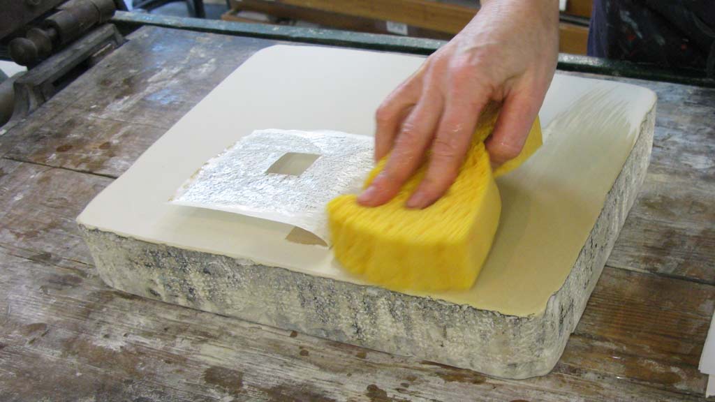
Initially, the stone is smooth and cleaned by wiping it with another stone, once you have beveled the corners. Once it is dry, we proceed by drawing with a pencil or a lithographic crayon directly on the stone. In this way you will get the prints very similar to pencil drawings, with shading and chiaroscuro.

Once the drawing is finished, you should dust the surface of the plate with fine talc and skip to the etching of the matrix, stretching out on the entire stone a solution of arabic gum and acid with a broad brush and letting it dry for at least 12 hours.

The next steps are washing the acid away from the stone and spreading a thin layer of arabic gum to protect the parts of the stone that will remain white.

With a solution of turpentine and oil you check the areas of the matrix drawn with the pencil or the crayon, removing them, and you pass a thin layer of “litofina” (a mixture of tar and turpentine), which, penetrating into areas previously drawn, makes them even more fatty and therefore easily inkable.

After it has dried, you dust with talc, making the stone a matrix ready to be printed with a lithographic press.


BRUSH LITHOGRAPHY

In the brush lithography technique, the preparation of the stone is the same as described above, with the difference that the drawing is made on the stone with a brush and with the lithographic ink. To obtain various color shades, it is appropriate to dilute the ink some water. In this way, the array will report on the lithographic printing an effect very similar to a painting, with the gestures and the variety of signs that this could give.

To get a good variety of tones, from the lightest to the deepest black, the stone should be treated with a neutral soluble salt. The rest of the processing of the matrix is the same as described above for the crayon or pencil technique.

Engraving – part #2

2. CHALCOGRAPHY

The copperplate engraving is a “hollow” printing technique. The signs engraved on the plate take the color and transfer it on the paper during the printing process, while the areas of the matrix that have not been processed retain the color of the paper. In this way, the signs made on the matrix become directly the signs that will be printed on paper.

The chalcographic matrix is a sheet of metal (copper, zinc, brass, aluminum) that can be more or less hard, and which can be worked directly (in this case the strength of the hand, with the help of metal tips, engraves the matrix) or indirectly (here instead the acid corrodes and digs the sign on the plate).

DRYPOINT

Working in a direct manner, called drypoint, consists in engraving the plate with a hard point that, opposing more or less force, raises the barbs (small ridges of metal corresponding to the created groove). These ridges, together with the engraved sign, retain color during the inking phase and create a special and recognizable effect.

The processing in an indirect manner which makes use of acids and spread in different ways, often used together, which will give different results. The two main processes that I have experienced are: acquaforte etching and aquatint.

Drypoint – Venetian house in Castello district

ACQUAFORTE ETCHING

We use this technique to get marks on the sheet. The metal matrix, after being cleaned and polished is protected with a special paint, which will prevent the acid to act on the whole surface.

Thanks to a tip, signs are traced on the matrix that deprive her of her protection. Once the plate is immersed in the acid, these signs will be subject to the corrosive action in the metal engraving in the metal, more or less in depth, depending on the time of exposure in acid.

You can achieve different intensities in the various signs of the same plate, proceeding with various morsure (in acid baths) and protecting the signs you want to be lighter with the paint.

Aquaforte etching – Grand Canal from Accademia bridge

AQUATINT

This technique is used to obtain shades of different intensities on the plate. Even in this case, the slab must be protected from the corrosive action of the acid, but unlike the acquaforte etching, paint is not used, but a very fine powder evenly spread on the metal surface.

Then the slab is heated and the powder melts on it, protecting and allowing the acid to act simultaneously on the metal in a controlled manner.

To obtain different intensities it is sufficient to protect areas of the sheet that you want to keep clearer by spreading a layer of protective paint and working with various morsure.

An alternative to the use of special dust is to spread an even layer of spray paint on the plate.


Aquaforte + Aquatint – Ponte Chiodo in Venice

SUGAR LIFT

The other technique that I used in my work is the so called sugar lift, which makes possible to achieve an effect similar to watercolor.

This technique consists of painting the plate with a brush soaked in a special sugar solution, and once dry the plate is covered with a thin layer of protective paint. Later, hot water is poured on the slab which separates the paint from areas treated only with the sugar solution, and we proceed to protect exposed areas as in aquatint (with special fine powder or spray paint).

At this point the plate is immersed in acid as usual and it is possible to proceed with the various morsure.

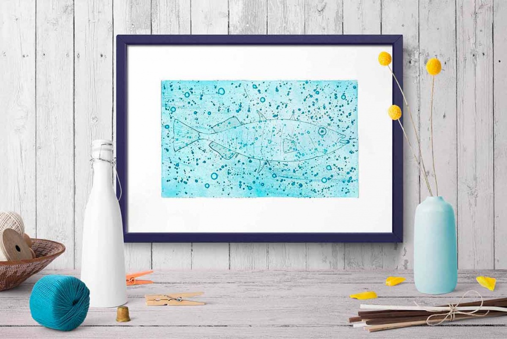
Aquaforte etching + sugar lift – Fish

Sources

show